Summer Paradise: A Creative Typeface for Logo Design & More!
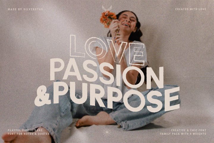
SilverStag presents Summer Paradise—a perfect recollection of this year's summer adventures, as the warmth fades. Summer Paradise comes in rustic, solid, and solid rustic fonts styles —each featuring light, regular, and bold font weights. It has the confident air of coincidental perfection, an effortless artistry that results in a warm, natural, gorgeous font. Summer Paradise is a creative typeface perfect for logo design, branding, posters, social media, corporate identity, package design,
Commercial
A Fabulous Decorative Font, Inspired by French Lifestyle
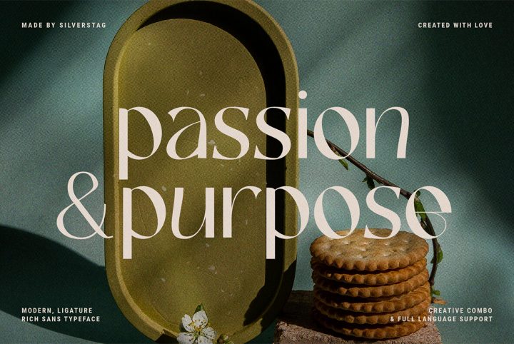
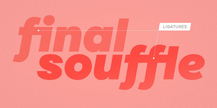
It's time once again to jump on the SilverStag, grab the horns and gallop! Today it's the marvelous French Chateaux. Another Stag design inspired by France, you can see French architecture, vintage typefaces, modern shapes, fashion, and the globally revered French lifestyle in this fantastic font. French Chateaux includes over 35 chic ligatures! "Its contrast lines and curves will give your design that chic and modern appeal you are looking for," says Stag. French Chateau is perfect for
Nomina – a practical sans serif font inspired by the roots of Helvetica
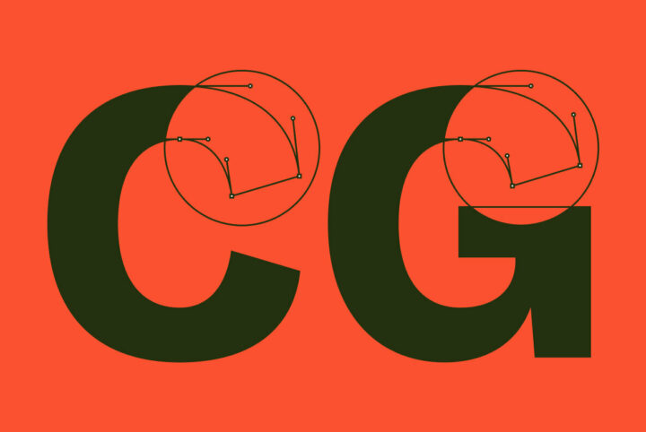
Inspired by classic grotesque fonts like Venus and Akzidenz-G, the brilliantly executed sans serif font Nomina proves there is plenty of room to be creative and distinct within a highly usable font. Nomina's clever details distinguish the font, while in no way impeding Nomina's smooth readability. The design is perfectly balanced, details precisely harmonized. Open apertures evoke subtle quirkiness, with sharp terminals on each rounded glyph adding extra distinction. Nomina also includes
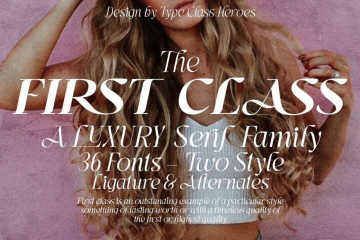
A First Class Branding Font for Today’s Graphic Designers
First Class has a clean, modern look that is perfect for branding and logo design. First Class says sporty luxury, on-the-go, classic yet timeless. It is excellent for visual identity, luxury goods, package design, social media posts, poster art, book titles, and more—any situation that requires that first class sparkle. And while this luxury serif family can be used in vintage design settings, it can also evoke a fresh, cutting-edge modernity that is completely in-the-now. Plus, First
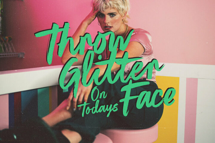
It’s the Perfect Hand Painted Font…
If you're looking for a brush font that looks like it was painted with an actual brush, you might consider choosing one that was painted with an actual brush: Little Delights. Designer Sam Parrett presents a remarkable 429 glyphs that each started wet. The flowing, brushed appearance is exactly what you need for a painted look that has all the charm and none of the mess. A natural brush font speaks of blue skies, lightness, and buoyant moods. It's a cool breeze and a healthy drink, an
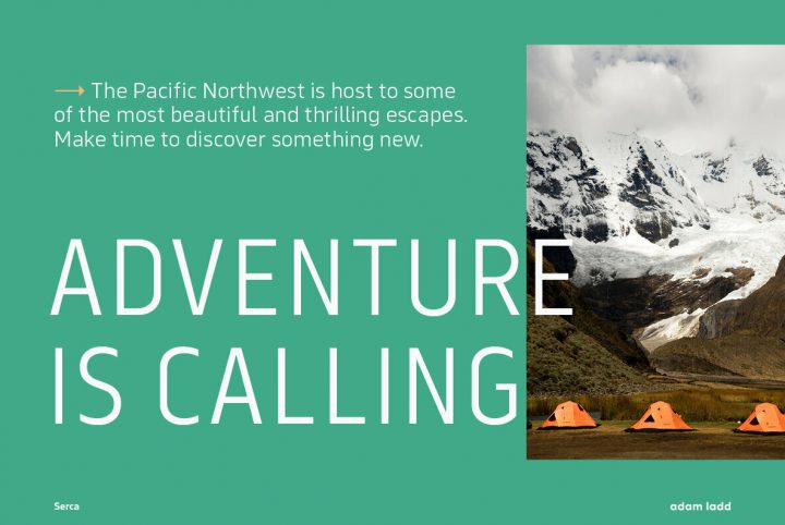
Serca: Geometric Sans Serif from Adam Ladd
Adam Ladd is a type designer based in Cincinnati, Ohio. He creates fonts that are professional, versatile, and perfectly rendered. His work is in demand: his fonts have been licensed by Harley Davidson, Food Network, Disney, Trader Joe's, Starbucks, Whole Foods, Costco, Penguin Random House, L.L. Bean, NHL Calgary Flames, Raising Cane's, and Blizzard entertainment. His areas of expertise include type design, font licensing, logos, graphic design, print design, magazine design, and art
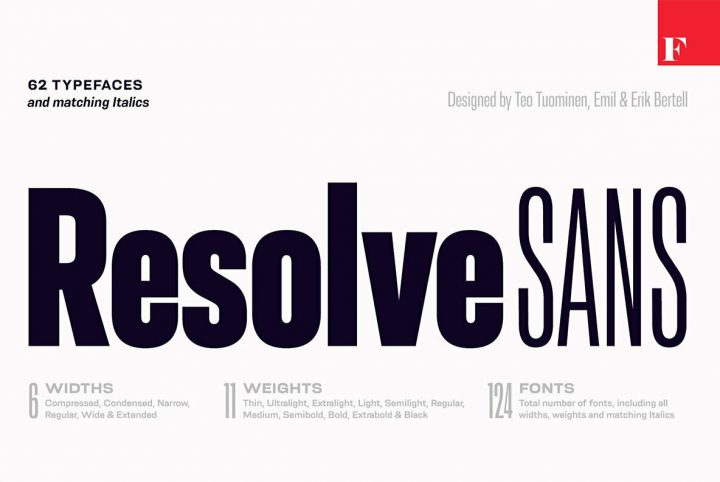
Emil Bertell Has Resolve
Emil Bertell has apparently resolved to cure font-shopping by creating one font family for all needs, all the time: Resolve Sans. He's just the man for the job, as his powerful track record proves. Turku's typographic main man already had something for everyone, with a collection ranging from the hardworking and practical to the artsy and defiant. For instance, consider his PunkRocker when you want that gig poster to shout it out loud, or his Lawrence for sophistication and quiet
Eastman Condensed from Powerhouse Foundry Zetafonts
Designed in 2020 for Zetafonts by Francesco Canovaro and Andrea Tartarelli with help from Solenn Bordeau and Cosimo Lorenzo Pancini, the original Eastman typeface family was conceived as a geometric sans workhorse family developed for maximum versatility both in display and text use. The original wide weight range has been complemented with three more additional widths, to give you maximum control over the appearance of text in your page. While Eastman Compressed and Eastman Condensed
Go All the Way with Adam Ladd’s Lufga
Adam Ladd has got it. "It" is the ultimate artistic intangible. You know it when you see it, hear it, feel it. It's the mysterious creative singularity that gives an artist a "voice." And although it's not guaranteed, having it often begets results. Ladd is an example, as this Cincinnati, Ohio based designer boasts clients like Harley Davidson, Food Network, Disney, Trader Joe's, Starbucks, iD Mobile, Costco, Hobby Lobby, L.L. Bean, Whole Foods, Minted, the Calgary Flames, Raising Cane's,
Mont Blanc from Fontfabric
We are pleased to report that Fontfabric is here again with the geometric Mont Blanc. The Mont Blanc type family consists of 16 fonts. Mont Blanc is excellent for advertising, display, corporate, headline, logo, poster, magazine, and e-book. Per the latter, take some time to consider how Mont Blanc pairs with other fonts. For example, try Fontfabric's Alkes as a header over Mont Blanc text, and then switch it around. You can see how these pairings introduce completely different moods to
Straight from the Cardium
The word Cardium comes from the Greek word for heart. Used alone, it denotes the heart's protective region. It also refers to the Cardium Formation, an oil and natural gas area of Canada, and it denotes Cardium Pottery, a signature of the Neoloithic era. In 1758 the common cockle, an edible clam, was given the binomial Cardium edule by Carl Linnaeus, the father of modern taxonomy. In 2021, Cardium is a hard-working 54-font modern geometric sans from Yellow Design Studio. It’s
Meutas: An Everywhere Font
We are confident Meutas is a font we'll be seeing a lot of very soon. This is the brilliant common object, the indispensable tool we take a closer look at and realize we are holding a work of art. Meutas can be broadly applied across a sprawling range of commercial, technical, and private mediums. It is ideal when the message is king and the font needs to support that by being clean, effective, and subtle. Meutas is ideal in that respect: simplicity and balance hum in a perfect union of
Malik: The New “King” of Sans Serifs from Zetafonts
For nearly 20 years, Zetafonts has been releasing some of the most beautiful typography available on the commercial market. Based in Florence, Italy, their type designs have remained consistent in quality and aesthetics, featuring letter sets that are as close to flawless as possible and incredibly versatile in the design workspace. Their studio is one that prizes collaboration, innovation, experimentation, and creativity that knows no bounds. No matter what project they’re working on,
LC Gianluca: A Dramatic Flare Serif From Compania Tipografica de Chile
Founded in 2018 and based in both Chile and Argentina, the Compania Tipografica de Chile is operated by Gastón Uribe, Raúl Israel, and Alexis Navarro. The idea behind Compania Tipografica de Chile arose from their shared affinities for type design. When the foundry was established, the designers behind it made a decision to combine their enjoyment of “calligraphy, digital design, lettering and everything that could be about letters,” they explained. The international foundry is
Allrounder Monument: A Timeless Serif Inspired By Ancient Rome
Based in Kempen, Moritz Kleinsorge is a graphic designer and typographer focused on brand, editorial, and type design. With a master’s degree in communication design and a wealth of experience under his belt, Moritz is well-versed in the ways that type affects a design project. “During my studies, I realized the charisma of typefaces and their power to support the meaning of a project,” he explained. Moritz’s love for lettering is what led him to begin designing typefaces, a
Garbata: A Sans Serif That Mixes Craftsmanship and Artistry From Zetafonts
Established in 2001 by Francesco Canovaro, Debora Manetti, and Cosimo Lorenzo Pancini, Zetafonts is nestled in the beautiful city of Florence, Italy. The foundry is well known for focusing on typographic styles that straddle the line between display and type, making the most of their versatility. Zetafonts finds that passing fads have their place, but it’s not necessarily in their studio — they strive to achieve a sense of timelessness with every type design they release. For
Dol: A Contemporary Geometric Sans Serif From Supply Of Fonts
With a background in branding, UI design, and web design, Changki Han is a graphic designer and artist born and raised in Seoul. Although he works as a senior designer, he works on freelance and commissioned projects that include logo design, posters, illustration, and user interfaces. Changki adores his field of work. “I simply love designing,” he explained. “I know that sounds cheesy, but to start with a blank page and to see the result after months of hard work is very
Glory Culture SVG Font, New From Set Sail Studios
Based in Bristol, Sam Parrett is the designer and typographer who established Set Sail Studios, an online store and digital foundry with an emphasis on expressive handwritten type designs. With a background in graphic design centered on the music industry, Sam’s typography makes you feel something whenever you look at it — while words are conveyed through letterforms, emotions are conveyed through the architecture of the fonts themselves. Set Sail Studios’ releases are always
Cannon: A Contemporary and Dynamic Sans Serif From W Type Foundry
W Type Foundry originally started off under the name, Without Foundry, when it was first established by Felipe Sanzana and Diego Aravena Silo in 2012. The two men met while they were both involved in a lettering and typography degree program at the University of Chile. They took their ideas and fondness for designing letters and built a digital type foundry that is still going strong nearly a decade later. Operated by Diego Aravena Silo, Patricio Truenos, Magdalena (Bana) Arasanz, and