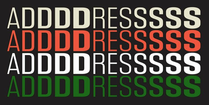
For all the technological advances we enjoy in our fast-paced world, we are still inherently drawn toward design elements from the mid-1900s and it’s a trend that really shows no signs of stopping. The fact is that nostalgia sells — and it probably always will. Midcentury graphic design, sometimes known as midcentury modern or “mid-mod,” first emerged as a response to the Art Deco movement of the 1920s and 30s, an era that prized opulence and luxury and all things just a little bit over the top.
The pendulum would swing back as the Art Deco movement met with its eventual decline, favoring design elements that instead prized simplicity, function, and very little in the way of ostentatious frills. The typical “Hollywood glam” of Art Deco was replaced with a minimalist approach, giving preference to basic geometric shapes, clean lines, and an emphasis on function over form.
Characteristics of Mid-Century Graphic Design
Perhaps the best way to describe midcentury modern design is the familiar expression, “less is more.” The earliest hints of mid-mod design began in the 1930s but it didn’t fully take flight until the end of World War II. At that point, soldiers were coming home and life was returning to some semblance of “normal.” Where Art Deco was geared toward the elite, mid-mod design was about accessibility and, most importantly, stability.
Some of the key characteristics of design in general during the 40s, 50s, and 60s included a more conservative style with a minimalist flair, very little ornamentation unless it served a distinct purpose beyond “just looking pretty,” and clean lines with predominately geometric influences.
Color Pallettes in Mid-Mod Graphic Design
Mid-mod design wasn’t really limited to specific color palettes; however, certain hues and color combinations were favored over others depending on the decade. For instance, the 1950s embraced a lot of vibrant palettes while the 1960s gravitated to more earth-toned hues. Mid-mod style is pretty flexible as long as you’re sticking to the basic characteristics of the design movement.
In terms of actual home decor design, the mid-mod movement blended a lot of different materials for the sake of experimentation and oftentimes, stark contrast. That same contrast was applied to fonts and graphic design in general.
Mid-mod graphic design conveys a complex idea or message by distilling it down to its barest form. Ample white space paired with legible text and geometric shapes is the basic foundation of this design style. From there, color, texture, shading, or patterns can be added. If you’re looking to evoke the 50s, you might try pairing combinations of lemon yellow, sky blue, fuchsia, mint green, or poppy red. For more 60s-inspired designs, you’ll probably lean toward more earthen combinations like muted red and sunset orange, jade or olive green, tans and browns, rich mustard yellow, and yes… even the “dreaded” avocado.
Typography in Mid-Century Design
Midcentury typography revolved around simplicity and clarity. Bauhaus and Swiss Style are two hallmarks of midcentury type. Utilitarian sans serifs reigned in the mid-1900s, bringing classic type designs like Futura, Helvetica, Univers, Frutiger, and Akzidenz Grotesk to the forefront of graphic design. That isn’t to say serifs didn’t have their place; Garamond, Century Expanded and Clarendon certainly had their roles to play, as did funkier display types. Just as mid-mod decor blended contrasting materials like cloth and metal or wood and plastic, mid-mod graphic design would often combine contrasting fonts.
Illustration Style in Mid-Mod Graphic Design
Midcentury illustrations were also distinctive. While they varied in complexity from basic cartoon figures to nearly photograph-quality renderings (and everywhere in between), they favored simple lines and brush strokes with a typically limited color palette. Advertisements in particular often captured the idyllic American life with a side of humor, featuring happy people using happy products to enrich their happy lives. This level of optimism and joy was likely an after-effect of post-war America. The economy was booming and people just wanted to move past those dark days and live their lives, looking toward a comfortable and stable future.
And they did. Even now, when we watch syndicated reruns of old television shows like Donna Reed or Leave It To Beaver, we’re struck by how simple and wonderful life was… at least on the screen. And it’s a big part of the reason why — even now — contemporary graphic designs still seek to capture the essence of the mid-1900s. It’s comforting, inviting, warm, familiar… and perhaps above all things, hopeful.
YouWorkForThem offers loads of great midcentury and mid-mod design assets. If you’re regularly in search of illustrations, type designs, or print textures from that era, you’re going to want to bookmark the portfolios of Guerillacraft, RetroSupply Co., and Vintage Voyage Design — three of our most popular resources for midcentury design assets.
Mid-Century Print Pack from RetroSupply Co. is like having a 1950s print shop built right into your computer. This pack offers a set of five customizable Photoshop actions that will add a realistic retro print effect to your graphic designs, including ink and halftone effects, roughened edges, and 50s illustration and photo effects.
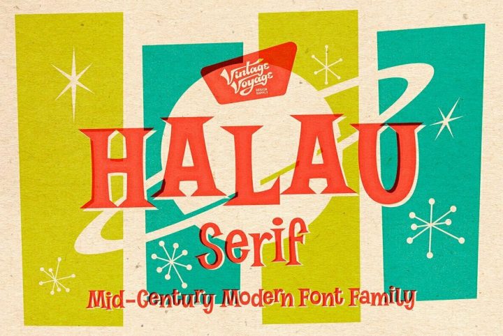
Halau Serif from Vintage Voyage Design is a quintessential mid-century font family with a decidedly cartoonish look. This fun retro type design is available in five weights that range from Thin to Bold so it’s perfect for everything from displays and signage to logos, website designs, product packaging, apparel, merchandise, publishing, editorial and print design, and mobile applications.
1950s Artist Brush Pack from Guerillacraft offers 39 brushes in total — 19 seamless pattern based brushes and 20 finger-smudged art brushes for Adobe Illustrator. The brushes in this collection work beautifully for detailed fine line artwork and vector painting, so you’ve got everything you need all in one place!
Retro Backgrounds from Dotstudio is a collection of 10 high-resolution images with a halftone texture. They’re great for backgrounds in illustrations or advertisements and can be used as layer effects in midcentury-inspired design projects.
Finally, if you’re not much of an illustrator but you want to build midcentury-style portrait illustrations, Cartoon Portrait Creator from Vintage Voyage Design is the ultimate tool kit — no drawing skills necessary! With 650 individual elements on hand, including hairstyles, eyes, noses, chins, mouths, ears, facial hair, and glasses, you can build thousands of faces in a fun cartoon style for design projects of all kinds.
Discover Midcentury Style Assets with YouWorkForThem
These are just a few of the midcentury design assets offered through YouWorkForThem. You can discover many more by typing any keyword (like 50s, 60s, midcentury, retro, or vintage) into our search bar in the upper right-hand corner of our site pages. You can also save yourself a step and just click here to search for “midcentury” design elements!

