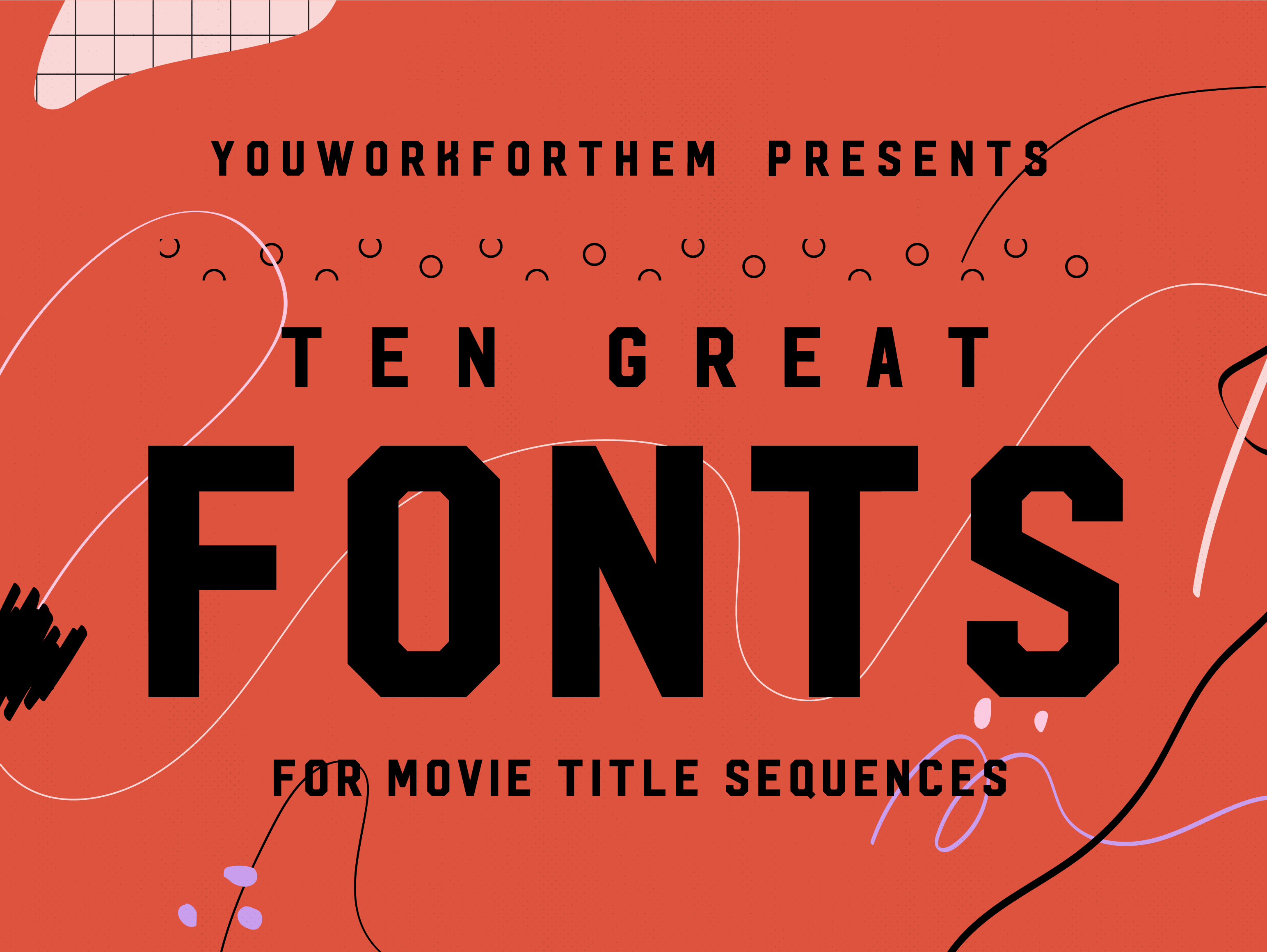
Choosing the right movie font for the opening title sequence is crucial to setting the tone and building the brand of the film. A well-designed font can make all the difference in the success of a movie’s presentation. Take “Jaws,” for example, if Comic Sans had been used, it would have completely shifted the mood away from the bloodcurdling terror that the audience was meant to experience.
Movies are (for the most part) as unique as the individuals who conceptualized them and we realize that creating a “Top Ten” list of fonts is basically an impossible task. Everything from the characters, the storyline, the setting, and even the dialogue, will ultimately influence a designer’s font choice for a movie’s title sequence. Instead, we have put together an idea list of ten great fonts for various movie genres to give designers some ideas to run with! These fonts are terrific for opening title sequences, DVD design, posters, and all of the merchandise that goes along with building a solid brand for a film.
1. Fast-Paced Action Movie
Danger Mode is built like steel with a bold construction that barely contains its physical aggression. Heroic and legendary, Danger Mode is tough as nails and takes no prisoners. This heavy type design is intense and bleeds vitality, adding a tangible sense of urgency to any action movie’s opening title sequence or movie branding.
2. Science Fiction Movies
Aperture is hella futuristic and, because it’s optimized for small point, it doubles as an excellent choice for credit sequences. The clean, simplistic lines of Aperture are inspired by data and technology, a digitally-driven design that’s perfect for the sci-fi film genre.
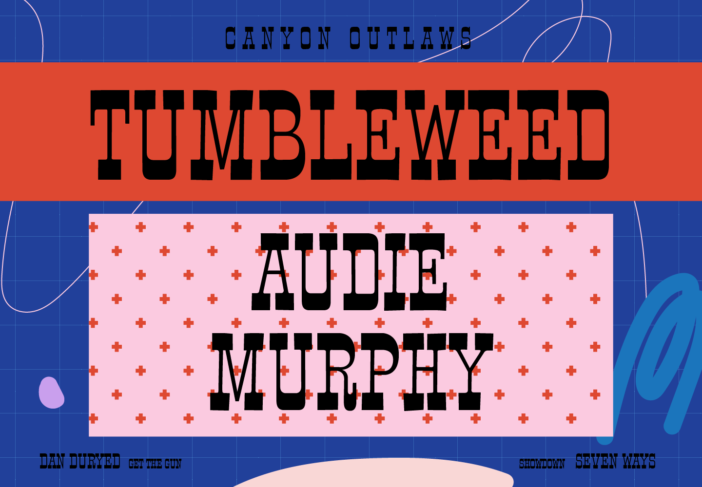
3. Western Cinema Typography
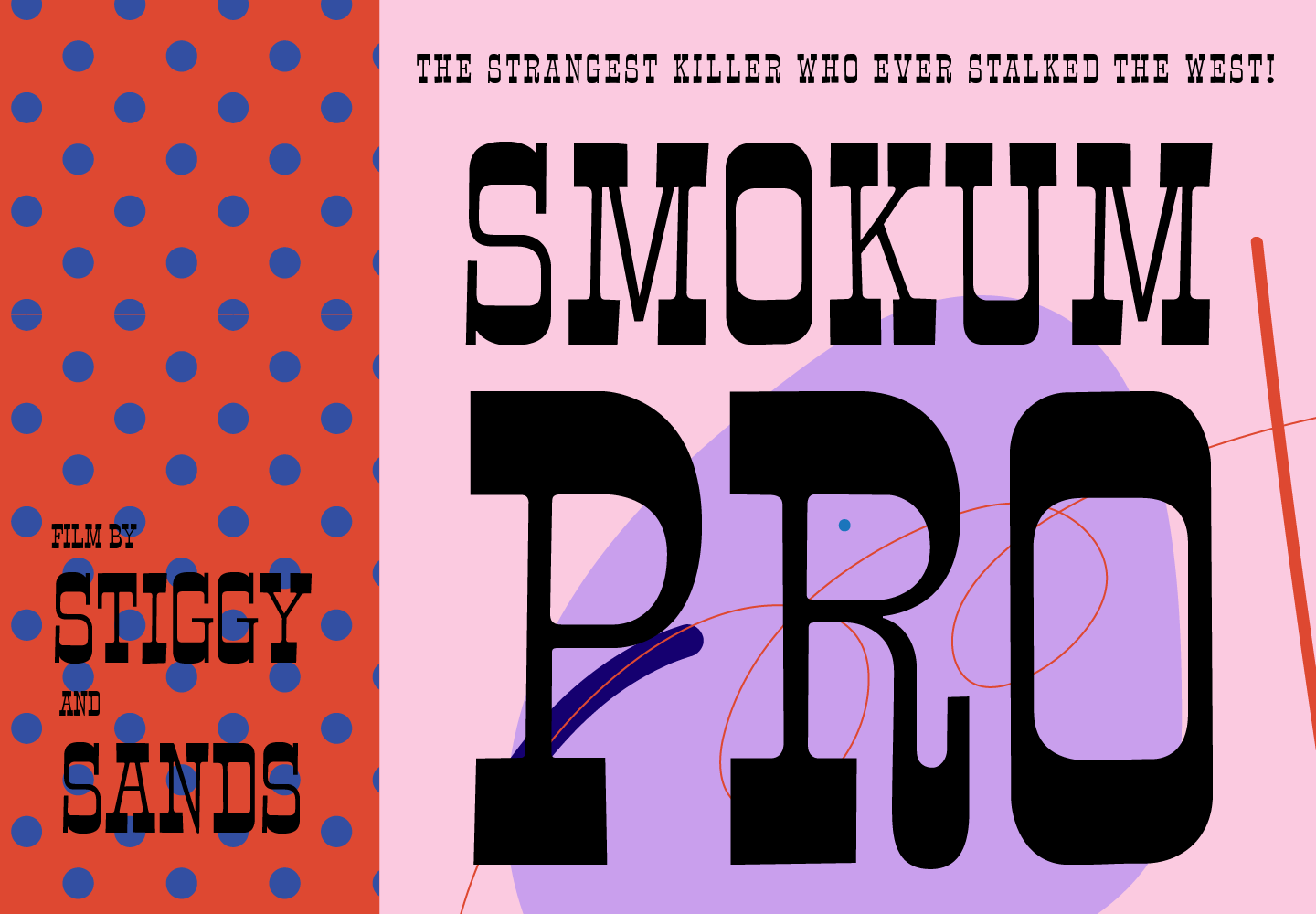
Smokum Pro has a slightly vintage feel, making it a particularly good choice for movies set in the wild west. Smokum Pro is a masculine type design whose saddlebags are packed full of OpenType features like small caps, caps to small caps, ordinals, superscripts and subscripts, fractions, and tabular, proportional, and old-style figure sets. Western movie title sequences designed with this font will make audiences want to put on their spurs and Smokum if they’ve got ’em!
4. Comedy Movie Titles
Bannock Brae Gothic is a casually cool font with a playful attitude that’s fitting for an indie comedy featuring quirky characters. Artsy and expressive, Bannock Brae Gothic is a bold sans serif that has enough personality to carry humor well.
5. Horror Movie Title Design
Cruller is rough around the edges and unsettling in all the right ways. Based on the letterforms found in a German lettering book from 1910, Cruller is a menacing serif font that will raise the hair on the back of your neck. If you’re designing a title sequence for a horror film, this font will definitely increase the creep factor and leave audiences squirming in their seats.
6. Romance Movie Fonts
Al Fresco is an expressive and gorgeously carefree script font. Soft brush strokes with a decidedly feminine touch make Al Fresco an excellent choice for the romance film genre. This font offers titling options, swashes, and ornaments through OpenType for extended branding versatility on DVDs and other merchandise.
7. Drama Film
Xander is a bold, handcrafted typeface that exudes a thoughtful, stoic posture. The resilient lines of Xander are a great option for the title sequences of dramatic films that intend to leave a lasting emotional impact on audiences.
8. Documentary Film Titles
Hudson NY is a strong display slab serif typeface. With a hard-hitting, serious attitude, Hudson NY is an excellent choice for documentary films that feature blunt commentary, explore controversial material, or tackle tough subjects through a critical stance.
9. Cel Animation Design
Clafoutis has a totally hand-drawn, cartoon vibe that’s perfect for cel animation films. The playfully rough edges of Clafoutis are full of exuberance, adding a bit of youthful mischief to titling and credit sequences in classically animated features.
10. CGI Animation Typography
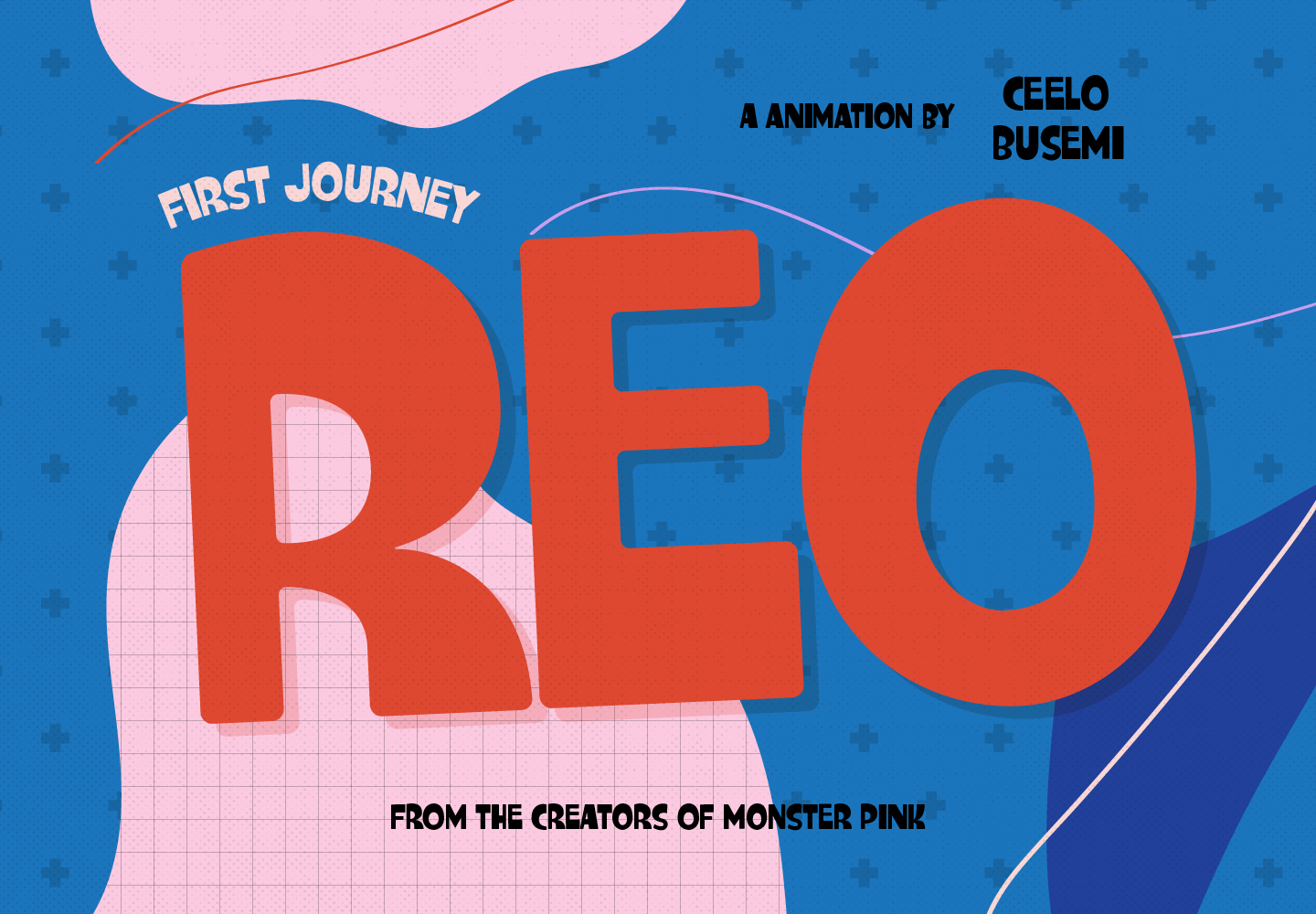
Charming Charlie is an informal sans serif that’s solidly built with softly rounded corners. Frolicsome and jovial, Charming Charlie has the proportions to stand up proudly in CGI movie title sequences, particularly when shadows are added for a three-dimensional effect.
While designing the opening title sequence for a movie, remember to not only take into consideration the legibility of the font you choose but consider the length of time it will appear on the screen. Serif fonts take a little longer to read than sans serifs; those, along with wildly decorative fonts, may need an additional second or two of screen time to be read by an audience.
If you’re not sure where to start in your search for the perfect font, don’t forget that YouWorkForThem has a great search function that will help you narrow down results by keyword!

