
Welcome to YouWorkForThem’s comprehensive guide to mastering the art of typography. Our definitive glossary explores the various terms and concepts that every design enthusiast should know. With over 20 years of experience providing the world’s best graphic design resources, we have curated this resource to help you understand typography’s intricate nuances and elevate your design skills.
Anatomy of Type
Ascender
The part of a lowercase letter that extends above the x-height, as seen in letters such as ‘b,’ ‘d,’ and ‘h.’
Baseline
The imaginary line on which characters rest, forming the foundation for a typeface.
Cap Height
The distance from the baseline to the top of uppercase letters, such as ‘H’ and ‘T.’
Descender
The portion of a lowercase letter that extends below the baseline, as seen in letters like ‘p,’ ‘q,’ and ‘y.’
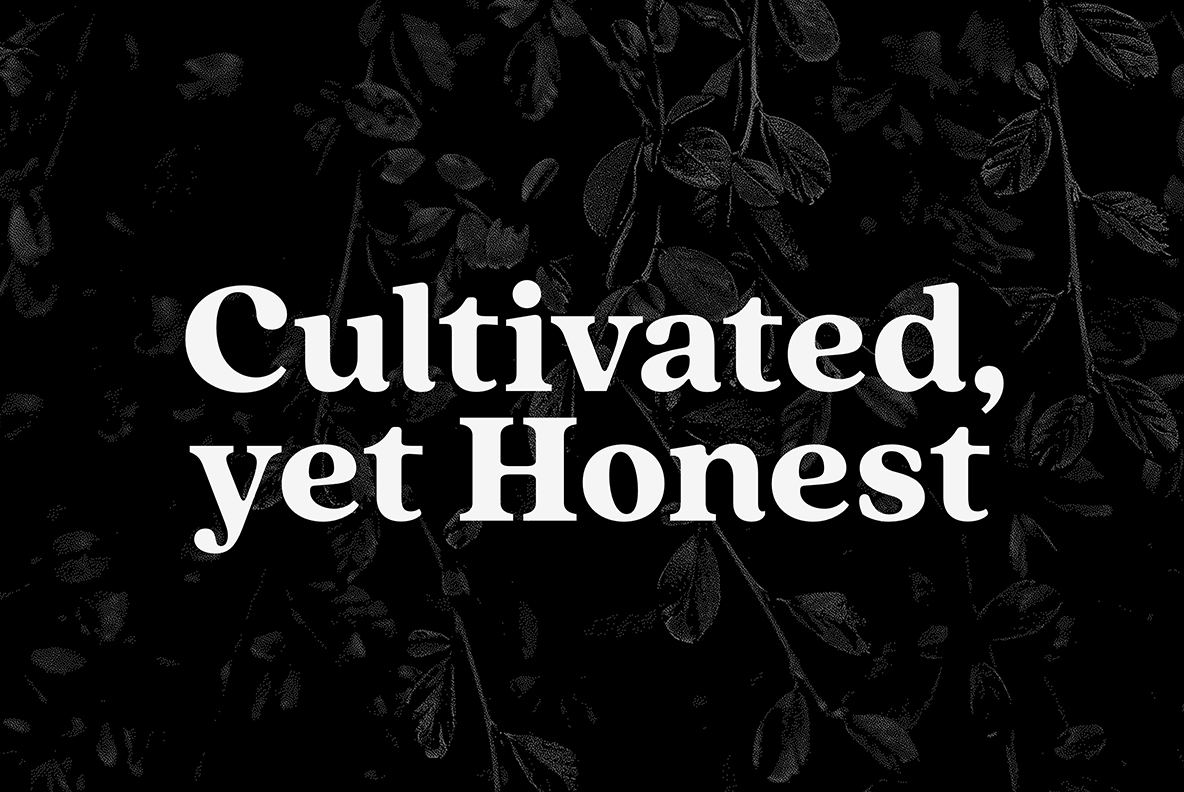
Serif
Small, decorative strokes at the ends of letters in certain typefaces, enhancing readability and style.
Stem
The main vertical stroke in a letterform, found in characters such as ‘I’ and ‘H.’
X-Height
The height of lowercase letters without ascenders or descenders, such as ‘x’ and ‘a.’
Type Classification
Serif Fonts
Typefaces with small, decorative strokes at the ends of characters. Examples include Quincy and Palatino.
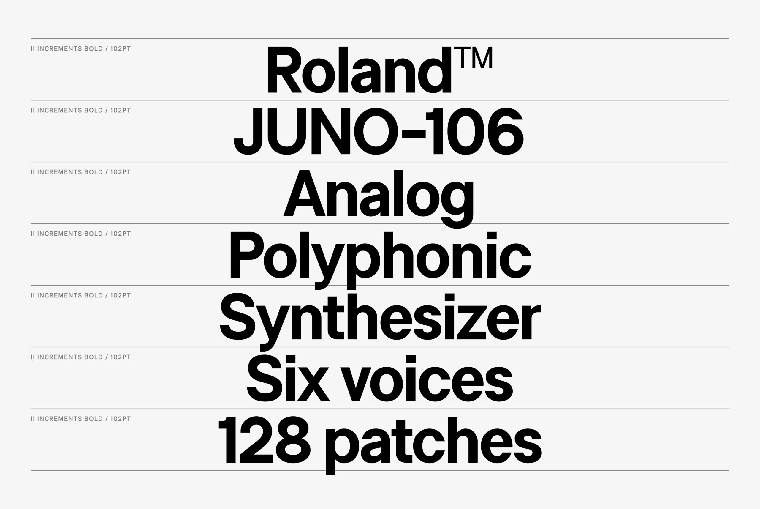
Sans Serif Fonts
Typefaces without serifs, characterized by a clean and modern appearance. Examples include Arial and Helvetica.
Slab Serif Fonts
Typefaces with thick, block-like serifs. Examples include Black Slabbath and Memphis.
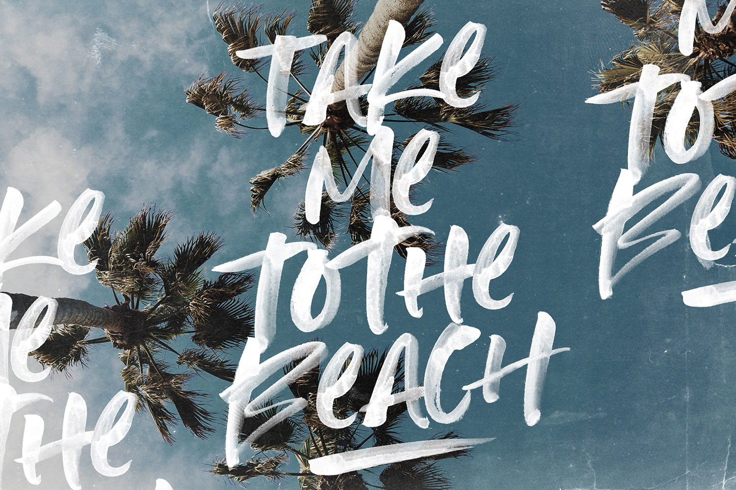
Script Fonts
Typefaces that mimic handwriting, featuring flowing, connected characters. Examples include Primed and Gilson Script.
Monospaced Fonts
Typefaces in which all characters occupy the same width, commonly used in coding and programming. Examples include Ingram Mono and Proto Mono.
Font Formats
TrueType (.ttf)
A widely used font format that renders well on both screen and print, compatible with most operating systems.
OpenType (.otf)
OpenType is an advanced font format that supports additional features such as ligatures, alternate characters, and small caps, providing enhanced flexibility.
Web Open Font Format (.woff and .woff2)
A modern font format specifically designed for web usage, web fonts offer optimized compression and fast loading times.
OpenType SVG (.otf or .ttf)
A font format that allows for the incorporation of scalable vector graphics within characters, enabling the use of gradients, textures, and color variations for a unique and expressive appearance. See our in depth blog post for more informaiton on OpenType SVG fonts.
Variable Fonts (.otf or .ttf)
An innovative font format that enables a single font file to contain multiple variations of a typeface, such as weight, width, and slant. The Variable font format allows for a wide range of customization and fine-tuning, while reducing file sizes and improving performance.
Typography Terminology
Alignment
The arrangement of text along a line, including left, right, centered, or justified.
Kerning
The adjustment of space between specific character pairs, enhancing readability and visual appeal.
Leading
The vertical space between lines of text, affecting readability and overall appearance.
Ligature
A single character representing the combination of two or more characters, often used to improve the flow of text.
Tracking
The uniform adjustment of space between all characters in a block of text, influencing readability and aesthetics.
Typographic Measurements
Em
A relative unit of measurement, equal to the current font size. For example, if the font size is 16 pixels, 1 em equals 16 pixels.
En
A relative unit of measurement, equal to half of the current font size. For example, if the font size is 16 pixels, 1 en equals 8 pixels.
Pica
A traditional unit of measurement in typography, equivalent to 12 points or approximately 1/6 of an inch.
Point
A standard unit of measurement for font size and leading, with 1 point equaling approximately 1/72 of an inch.
Pixel
A digital unit of measurement for font size, screen resolution, and design elements, representing the smallest displayable element on a screen.
Working with Type: Best Practices
Hierarchy
Establish a clear hierarchy in your design by using different font sizes, weights, and styles to guide the viewer’s attention and enhance readability.
Contrast
Ensure your text is easily legible by choosing colors that offer sufficient contrast between the text and the background.
White Space
Utilize white space effectively to create a clean and balanced layout, making your content more accessible and visually appealing.
Readability
Select appropriate typefaces and sizes to maintain readability across various platforms and devices.
Consistency
Maintain consistency in typography across your design, using a limited number of typefaces and a unified style for a cohesive look.
Wrap Up
By exploring this comprehensive glossary and adhering to best practices, you will improve your design skills and gain a deeper understanding of the art of typography. Harness the power of well-crafted typography to communicate effectively, engage your audience, and create visually stunning designs.
As a leading source for graphic designers since 2001, YouWorkForThem is committed to supporting designers in their pursuit of excellence. Explore our extensive range of fonts, stock graphics, and other design resources at YouWorkForThem. And remember, we are always here to assist you with any questions or needs that may arise—don’t hesitate to reach out!