Before we jump right into some of our favorite geometric fonts, let’s explore where this all started. Geometry as a mathematical science began to emerge somewhere around the sixth century B.C., with its core axioms being discovered in the third century B.C. The “father of geometry,” Euclid of Alexandria, was a Greek mathematician whose work influenced the entire framework of geometry as we know it today, including those mathematical proofs many of us came to loathe in high school. (Thanks a lot, Euclid. At least now we know who to blame.)
Mathematical proofs aside, every thing has a shape. In typography, the foundation for geometric fonts lies in the simplicity of basic squares, circles, and sometimes even triangles.
The Rise of Geometric Sans Serifs
The origin of geometric sans serifs can be found in 1920s Germany. By that time, sans-serif grotesk fonts had already taken root as a popular design style. The 20s were an era of typographic innovation and invention, a period when experimentation in type design really began to flourish. The architecture of geometric sans-serif fonts explores the structures of the most basic geometric forms. They commonly feature perfect circles for the letter “O,” for example, or the uppercase “M” might pair perfect triangles together. Futuristic-looking geometric typefaces often embrace squarish letter structures that epitomize technological advancement and mechanical innovation.
Two early examples of geometric sans serif typefaces include Herbert Bayer’s “Proposal for a Universal Type,” which only existed as a design in the 1920s, and Jakob Erbar’s “Erbar Grotesk,” released in 1926. Erbar had actually begun the sketch work on his font back in 1914, but World War I put that project on hold for more than a decade. With Erbar Grotesk, Erbar wanted to develop a typeface that would be legible while also lacking any individual characteristics or ornate flourishes. He focused Erbar Grotesk’s letterforms on the circle, a simple form that is perhaps the most fundamental shape of all.
The success of Erbar Grotesk influenced the geometric sans serifs that followed in its wake, including Paul Renner’s “Futura,” a font that subsequently went on to reach ever greater acclaim than Erbar’s cutting edge (at the time) design.
The Evolution and Adaptability of Geometric Fonts
In the 1970s, geometric type designs saw an explosion in their popularity. Herb Lubalin and Tom Carnese designed and released Avant Garde, which remains to this day one of the signature fonts of that decade. Disco came along and with it, bold, geometric designs became all the rage. In the decades that followed, the use of geometric type designs signaled the arrival of great technological advancement, particularly in the world of computers and global communication.
While geometric sans serif typefaces have existed for nearly a century, they have the unique ability to adapt to contemporary design aesthetics without really trying. Perhaps it’s because no matter how much time passes, the foundation of geometry remains unchanged, meaning that geometric type designs will always be relevant to our changing world and its design culture. Or, maybe their allure is a result of their simplicity; as the world becomes more complicated and technologically advanced, geometric typefaces remain especially attractive because they pare away the flourish, the individuality. They are clean and uncomplicated, ordinary and unpretentious.
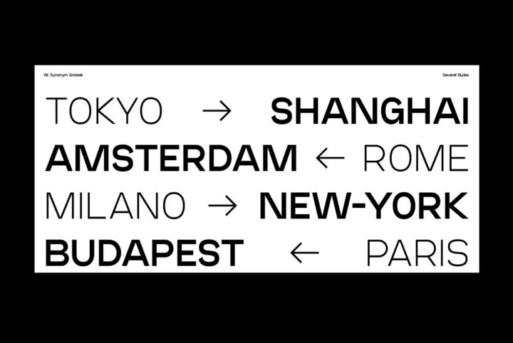
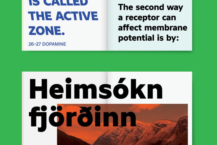
These days, modern geometric fonts can be found everywhere you look. They’re particularly well-suited to any design project in the industries of technology, computers, mobile applications, gaming, or science. They typically offer a high degree of legibility and their clean design conveys a message without it getting lost in unnecessary ornamentation.
YouWorkForThem offers a ton of geometric font designs from type designers around the world.
Some of our favorites include:
Radix, a typeface at the crossroads of classic and modern design, offers a unique combination of mid-century modernism and pronounced inktraps. Drawing inspiration from the Bauhaus movement’s geometric lines and Futura’s distinctive lowercase forms, Radix is a harmonious blend of historical and contemporary styles. Its seven weights and spurless characters, accentuated by captivating inktraps, create a visually balanced and engaging aesthetic. Additionally, its OpenType stylistic sets provide alternate glyphs, adding versatility and expressive depth to any design endeavor.
YWFT Valid, a distinctive sans-serif typeface from YouWorkForThem, embodies modern design with a nod to Bauhaus principles. Crafted for versatility, its geometric and minimalist features make it ideal for a diverse array of projects, from sleek mobile apps to impactful social media content. With its blend of classic elegance and contemporary flair, YWFT Valid is a go-to choice for designers seeking a typeface that balances timeless style with modern functionality.
Released by TypeType, TT Commons is a go-to, universal geometric sans serif that’s built to work well in just about any application. With 18 fonts to choose from (nine weights that range from Thin to Black, with corresponding italics for each), TT Commons is a clean, multi-use type design that’s perfectly at home in any graphic designer’s tool box.
Samuel Oakes’ Granary Typeface is a “rounded and refined” geometric sans serif. Designed with a minimalist approach, Granary Typeface is a modern type design that offers high legibility, even in small point. This complete family of 12 fonts is well suited to everything from business cards, labels, and fine print, all the way to large-scale displays, signage, logos, headlines, and everything in between. It’s a perfectly neutral and clean choice for things like corporate correspondence, white papers, and infographics, as well.
Toma Sans from JAM Type Design is a beautiful geometric typeface with a clean, professional appearance. Graceful and elegant, Toma Sans features classic geometric architecture with a decidedly contemporary flair. Available in seven weights with corresponding italics for each, this type design is a sophisticated choice for a wide variety of design applications.
Enhancing Digital Designs with Geometric Fonts from YouWorkForThem
YouWorkForThem is the go-to platform for finding the perfect geometric fonts to enhance your digital designs. With a vast selection of geometric sans serif fonts, we cater to various design styles and preferences. Our search tool makes it easy to find modern geometric typefaces, minimalist geometric fonts, and really just the best geometric fonts online for your specific needs.
We pride ourselves on providing easy personal and corporate font licensing, ensuring that you can use our geometric sans, geometric shape fonts, and geometric serif fonts without any legal concerns. Our instant download feature allows you to access your chosen geometric typography designs immediately, streamlining your design process and keeping you on schedule.
The Unique Benefits of Choosing YouWorkForThem
What sets YouWorkForThem apart is our cash back rewards program on all orders, making the process of acquiring a geometric slab-serif, geometric sans font, and other geometric type designs even more rewarding. Plus, our built-in type tester tool enables you to see how your chosen font will look with your own text before making a purchase, ensuring that you find the ideal match for your project.
With more than 180,000 fonts available in a variety of styles, YouWorkForThem is the premier destination for designers seeking the perfect geometric fonts to suit their needs. Explore our collection and experience the convenience of instant downloads, easy licensing, and cash back rewards for yourself. Your next geometric masterpiece is just waiting to be discovered!


