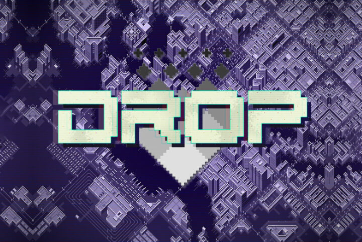
"Drop", the electrifying hacker/cyberpunk thriller game, is a testament to the power of well-chosen visual elements, including the all-important video game font. Understanding the crucial role that design plays in the gaming experience, Etherfield Studio meticulously selected every aspect of "Dr...
Feature
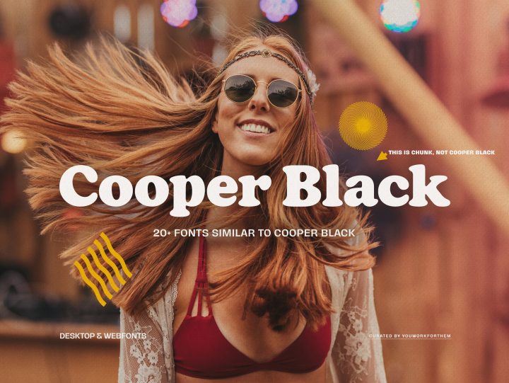
Evoking the spirit of bygone eras, the chunky and popular Cooper Black font brings a retro touch to your designs. Oswald Bruce Cooper initially crafted this typeface, ideal for headlines and logotypes, and larger body copy. While Cooper Black stands out with its unique playful and vintage aesthe...
In recent history, the 1980s style stands out as an era of vibrant colors and unforgettable subcultures. This vibrant decade, remembered fondly by Generation X and rediscovered by Millennials and Generation Z, left an indelible mark. It was a time of experimentation, flamboyance, and individuali...
May 7, 2023
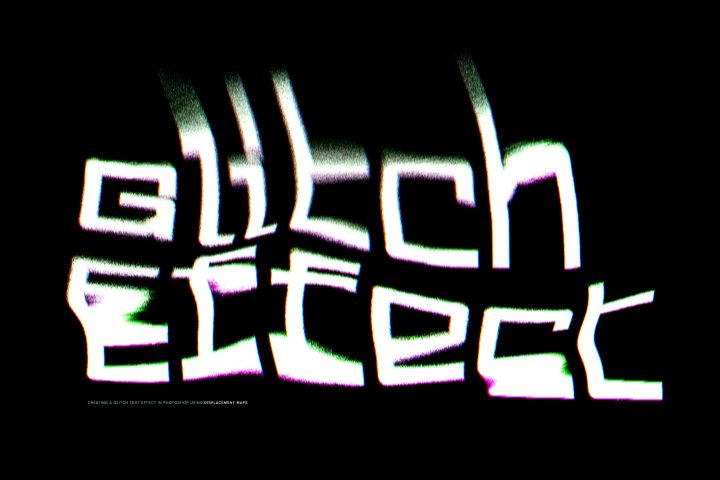
Creating a Glitch Text Effect in Photoshop
Our friends at Pixelbuddha are experts at creating first class design tools: Photoshop effects, logo mockups, photo effects, glitch effects, overlays, textile mockups, brushes, map creators, and more. In this special feature, Pixelbuddha presents a tutorial where you’ll create a poster design wi...
May 4, 2023
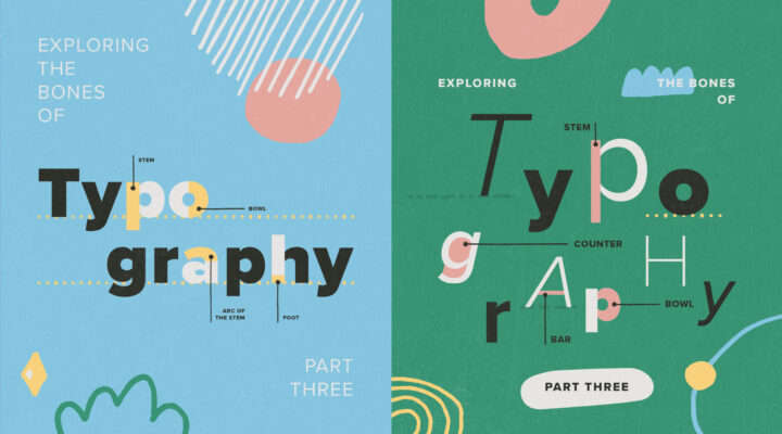
Exploring The Bones of Typography: Part Three
Understanding Typography Terms When you're reading through the product descriptions for fonts on YouWorkForThem, you'll often come across a number of strange terms that don't necessarily mean a whole lot unless you actually work in the field of typography. For type designers, a "counter" isn't j...
May 4, 2023
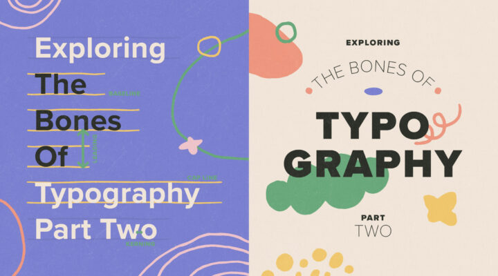
Exploring The Bones Of Typography: Part Two
Typographic terms can seem especially confusing when you don't know exactly what they mean. In Part Two of our "Exploring The Bones Of Typography" series, we're going to get into the actual placement and spacing of letters, numbers, and punctuation. When you're reading a block of text, a lot of ...
May 4, 2023
Exploring The Bones of Typography: Part One
Typographic terms can seem downright confusing when you don't know exactly what they mean, so we thought it would be fun to do a three-part series that really digs into the bones of typography. Through a little digital archeology, we're going to explore the structure of letters and drop a little...
The world of comic books is an exciting realm filled with vibrant characters and captivating stories. The right font plays a crucial role in bringing these tales to life on the page, setting the tone and style for readers to immerse themselves in. As we step into 2023, YouWorkForThem is thrilled...
YWFT Ultramagnetic: This is the bold, smooth West Elm font choice for the global home decor retail chain, in its worldwide marketing and branding efforts. Whether it's in-store displays, social media, or their corporate website in WebFont format, this font is integral to West Elm's global succes...
April 26, 2023
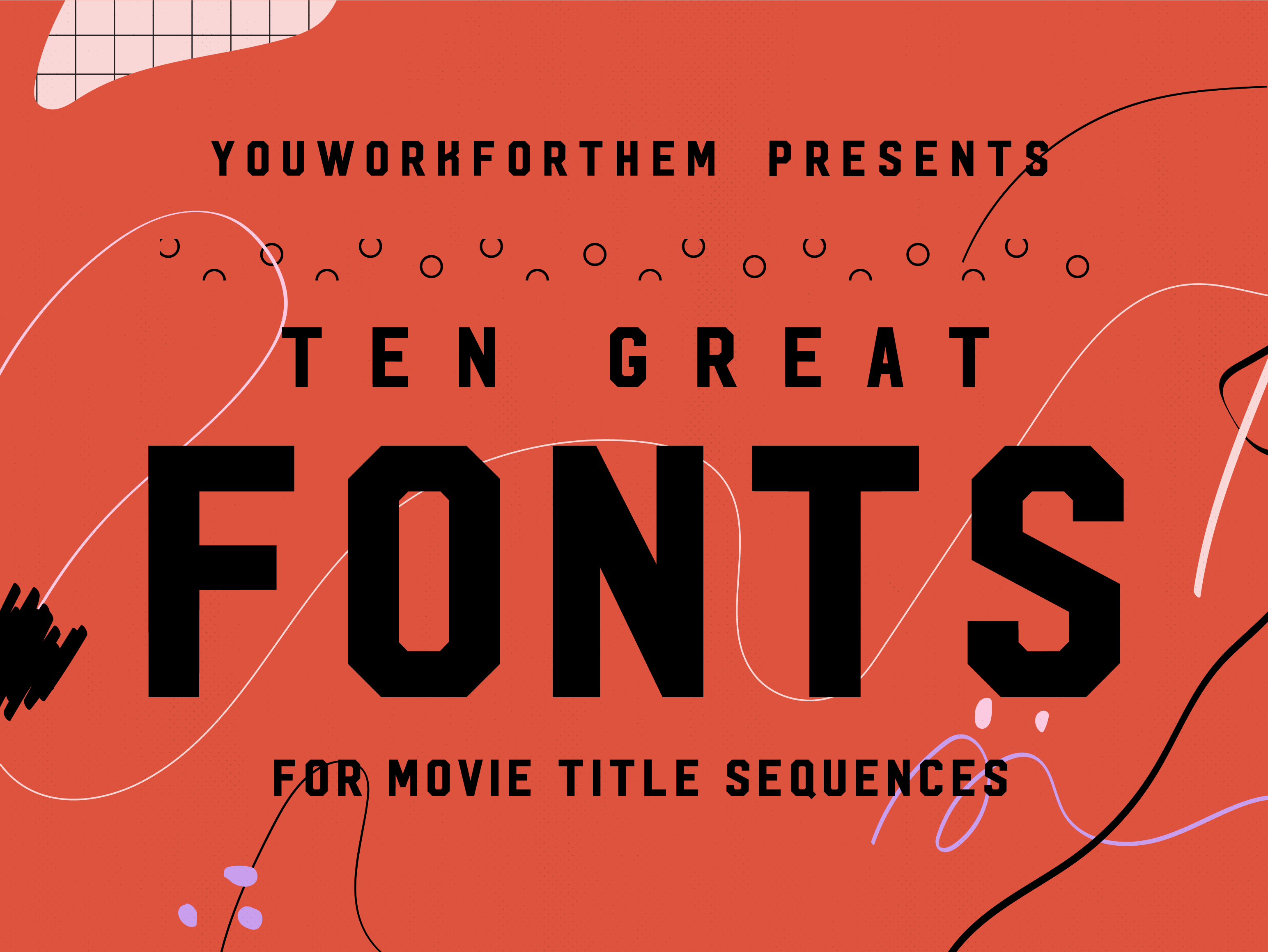
Ten Great Movie Fonts For Title Sequences
Choosing the right movie font for the opening title sequence is crucial to setting the tone and building the brand of the film. A well-designed font can make all the difference in the success of a movie's presentation. Take "Jaws," for example, if Comic Sans had been used, it would have complete...
April 24, 2023
Didone Fonts: The Unseen Influencers of Fashion and Luxury
At YouWorkForThem, we're excited to present an insightful exploration into the world of Didone fonts, a captivating genre of serif fonts often associated with high fashion and elegance. These fascinating fonts, including the likes of Didot font, Bodoni, have adorned the pages of countless fashio...
April 24, 2023
Transitional Serifs: Bridging Typeface History
We are excited to present this feature article exploring the rich history of various font styles, with this edition focusing on Transitional Serif Fonts. As you delve into the fascinating journey of these typefaces, we have handpicked five standout fonts from our extensive serif font collection ...

